At The Body Mechanics, we believe that every detail matters — not just in the care we provide, but in the way we represent ourselves. Our new logo isn’t just a design; it’s a reflection of our philosophy, approach, and commitment to helping every patient move better, feel stronger, and live healthier. Each element has been thoughtfully chosen to tell the story of who we are and what we stand for.

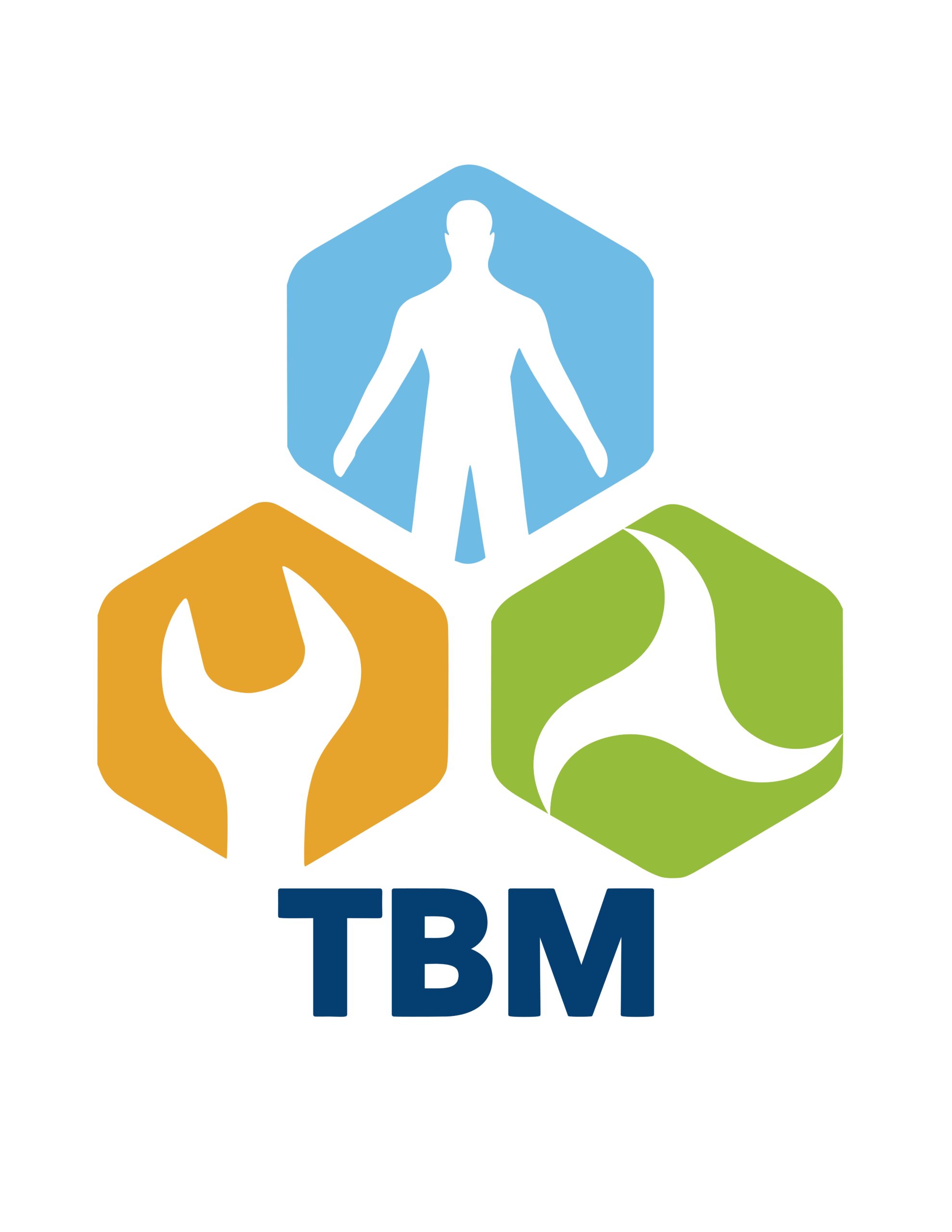
Our logo represents the philosophy and integrated approach of The Body Mechanics.
- The Blue Hexagon symbolizes the human body, the center of our work. The blue colour conveys calm, trust, and professionalism — qualities that guide every treatment we provide.
- The Orange Hexagon with the wrench represents the hands-on, problem-solving aspect of athletic therapy. Orange reflects energy, action, and recovery — reminding us that movement and repair go hand in hand.
- The Green Hexagon symbolizes movement as the foundation of assessment, treatment, and rehabilitation. The green colour evokes health, renewal, and vitality.
Together, the three hexagons form a connected system, reflecting how we view the body: as an integrated structure where mechanics, balance, and human function work in harmony.
The bold TBM anchors the logo, standing for The Body Mechanics — a team dedicated to restoring strength, balance, and motion.